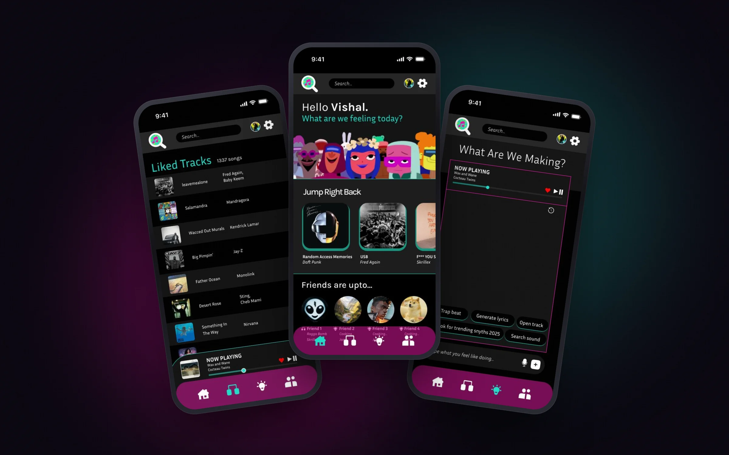
01 — The problem
Music streaming is a solitary experience.
- 01
No real-time togetherness
You can share a playlist or a link, but you can't listen together, at the same moment.
- 02
A fragmented social layer
Listening happens in one app, reactions in a messaging app, discovery on social media.
- 03
Creating is gated
Making music needs complex production tools, out of reach for most casual listeners.
Who it's for
Aarav, 22, a college student. He explores new genres and remixes, shares playlists, calls friends often, goes to gigs, and is curious about producing music but not ready for professional tools.
What he needs: one place to listen with friends, react in the moment, and dabble in making music.
02 — The idea
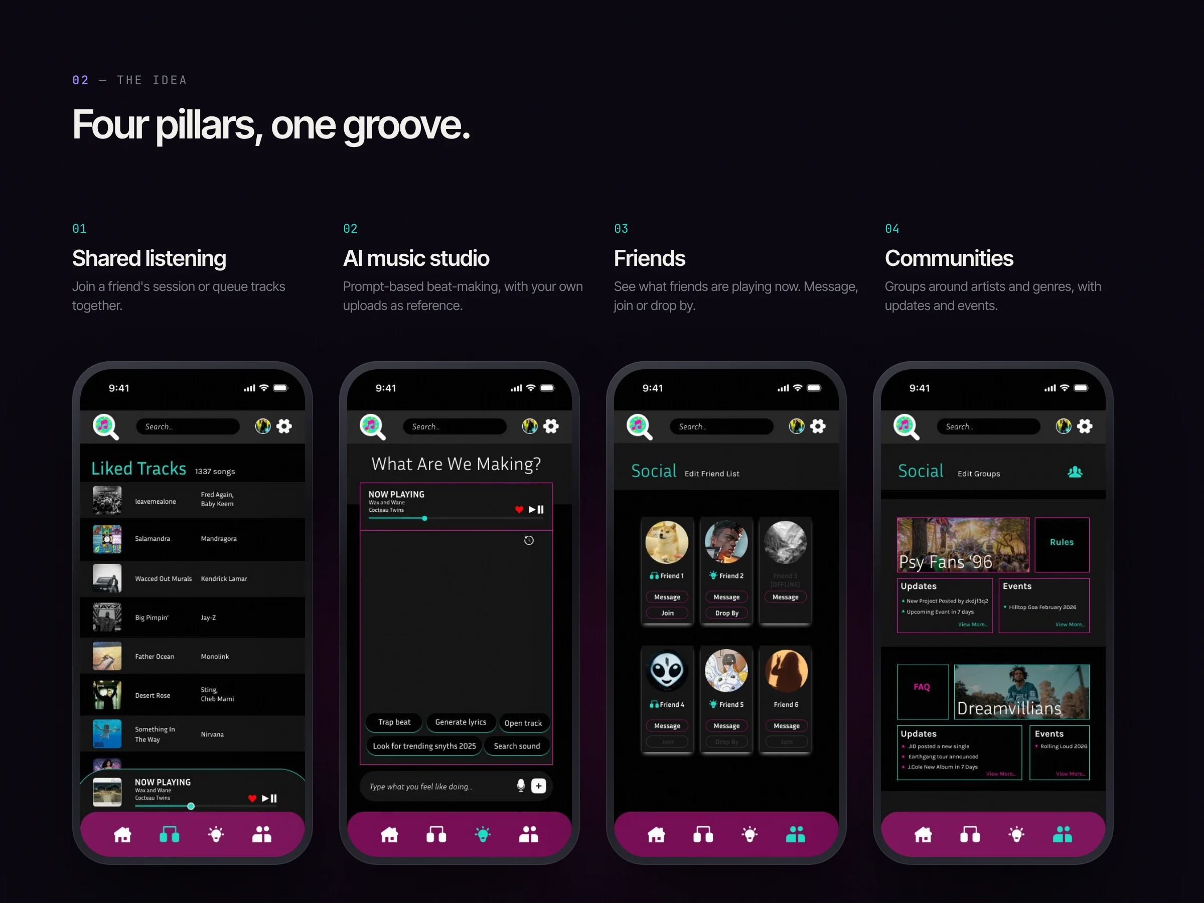
Four pillars, one groove.
- 01
Shared listening
Join a friend's session or queue tracks together.
- 02
AI music studio
Prompt-based beat-making, with your own uploads as reference.
- 03
Friends
See what friends are playing now. Message, join or drop by.
- 04
Communities
Groups around artists and genres, with updates and events.
03 — User flow
From opening the app to sharing a groove.
- 1 · Open
Splash
"Find your groove."
- 2 · Home
What are we feeling today?
Resume, browse, see friends.
- 3 · Pick a mode
Listen, jam or create
Listen, jam with a friend, or create with the AI studio.
- 4 · Share
Pass it on
Post to friends and communities; swap tracks and playlists.
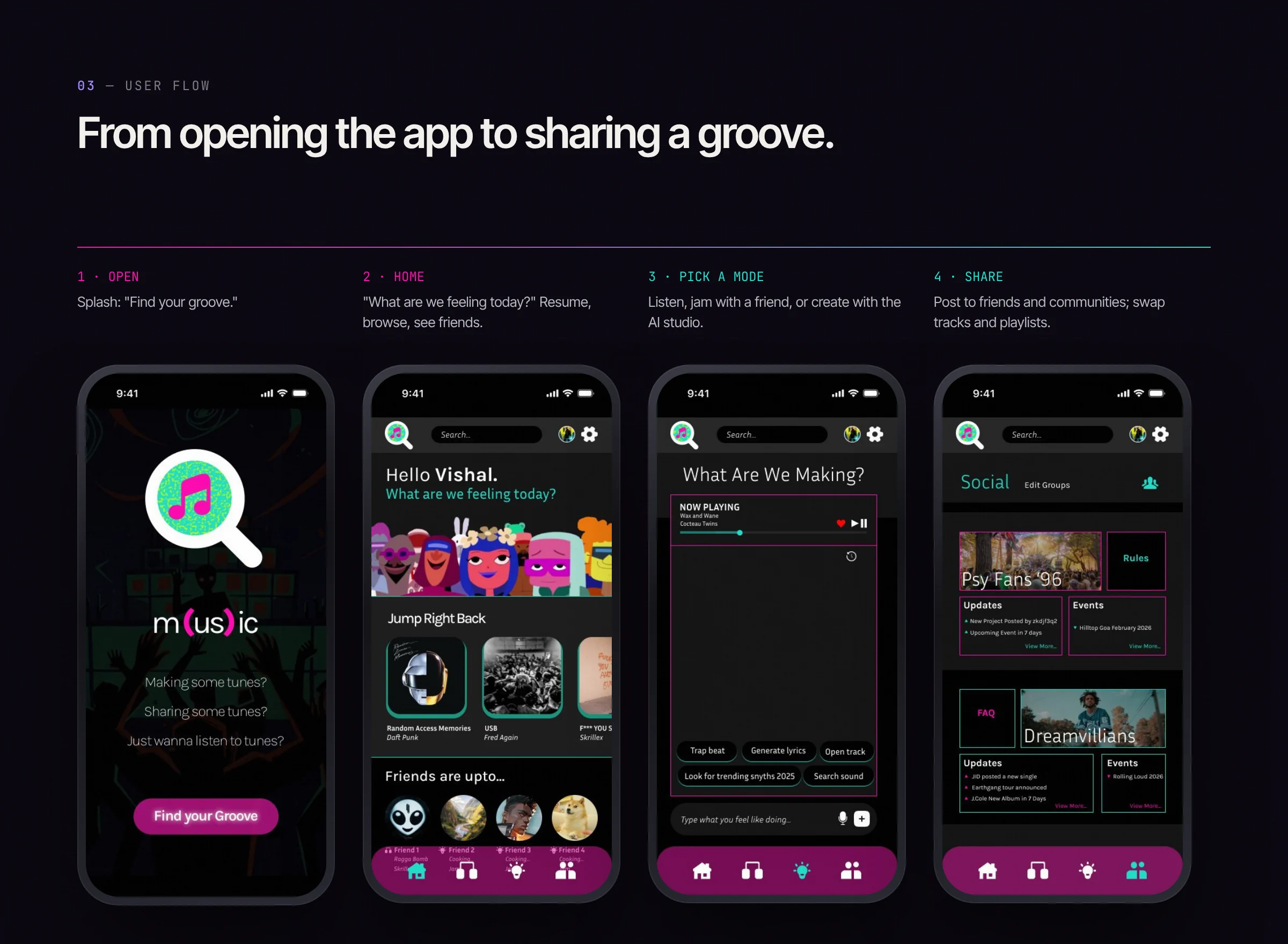
A persistent bottom nav keeps all four modes one tap away at any point in the flow.
04 — Information architecture
Everything within two taps.
- Tab
Home
Jump right back · Friends are up to… · Recommendations
- Tab
Listen
Liked tracks · Playlists · Now playing
- Tab
Create
AI prompt studio · Upload and tweak audio · Trending sounds
- Tab
Social
Friends and sessions · Groups and communities · Messages
Available everywhere: search, profile and stats, settings, and a persistent now-playing bar.
05 — Visual design
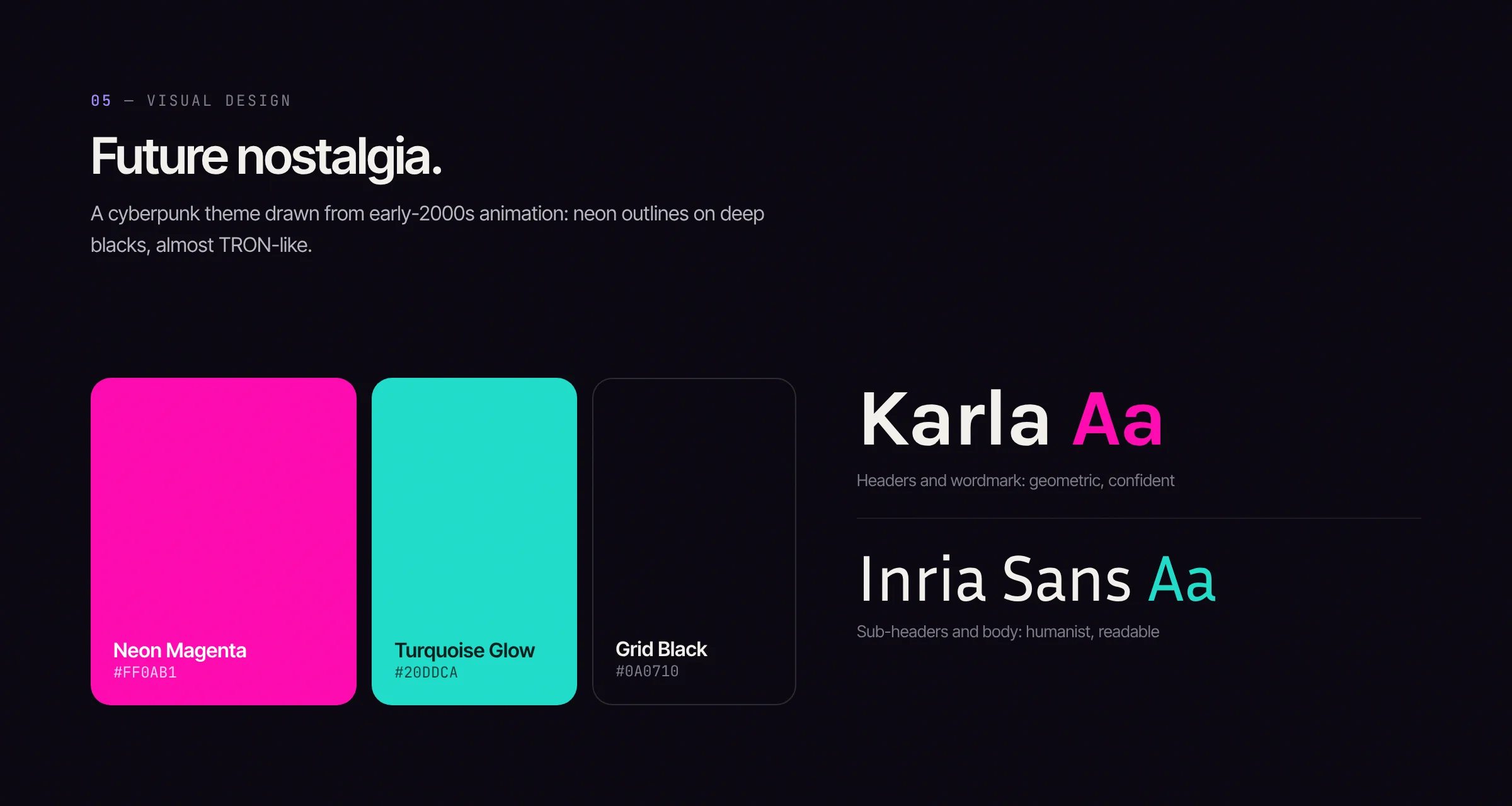
Future nostalgia.
A cyberpunk theme drawn from early-2000s animation: neon outlines on deep blacks, almost TRON-like. Karla for headers and the wordmark, Inria Sans for reading.
06 — Interactions
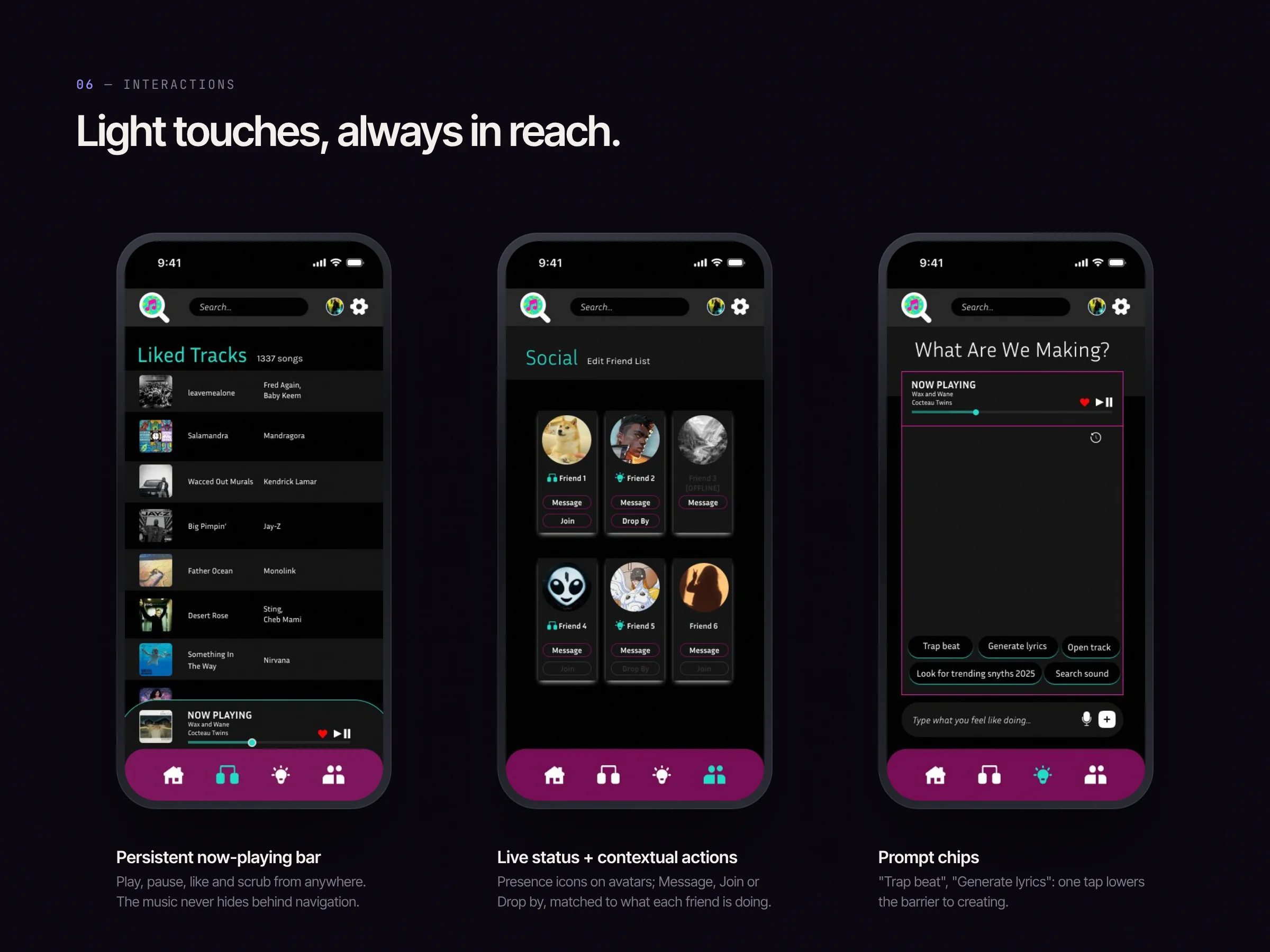
Light touches, always in reach.
- 01
Persistent now-playing bar
Play, pause, like and scrub from anywhere. The music never hides behind navigation.
- 02
Live status, contextual actions
Presence icons on avatars; Message, Join or Drop by, matched to what each friend is doing.
- 03
Prompt chips
"Trap beat", "Generate lyrics": one tap lowers the barrier to creating.
07 — Accessibility
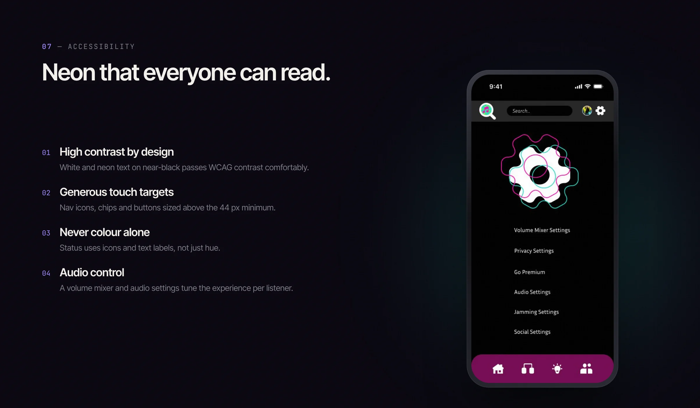
Neon that everyone can read.
- 01
High contrast by design
White and neon text on near-black passes WCAG contrast comfortably.
- 02
Generous touch targets
Nav icons, chips and buttons sized above the 44 px minimum.
- 03
Never colour alone
Status uses icons and text labels, not just hue.
- 04
Audio control
A volume mixer and audio settings tune the experience per listener.