

Complex software, made clear, calm and human.
Brand identities, campaigns and print
Made to catch the eye in seconds and stay true to the brand.
Dashboards and workflows for B2B
Dense, real-time data, made clear enough to trust every day.
I've spent 3.5 years on both sides, and the best work happens where they meet.
01 — Work
Selected Work.
Each case study starts with the problem, then shows what I made and why.
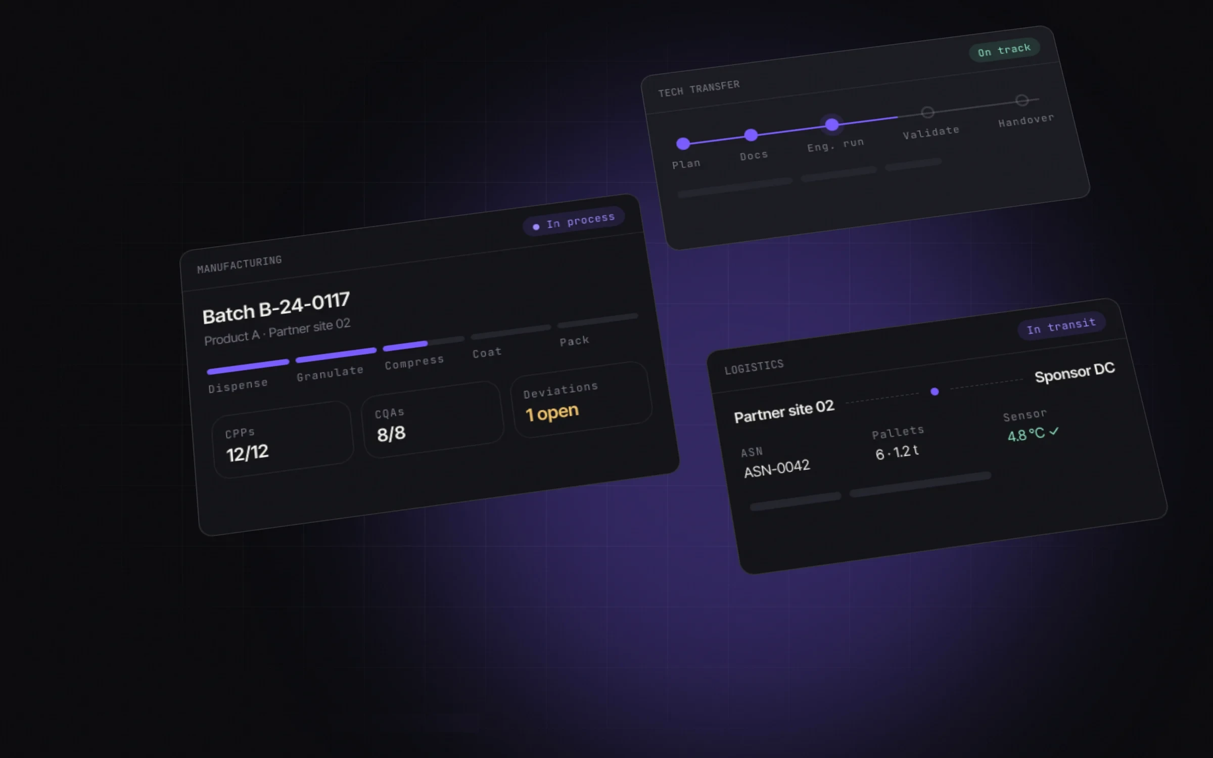
Mosymphony
Designing audit-ready collaboration software for pharma companies, their contract manufacturers and logistics partners.
Full transparency and traceability across end-to-end manufacturing, for manufacturers and sponsors.
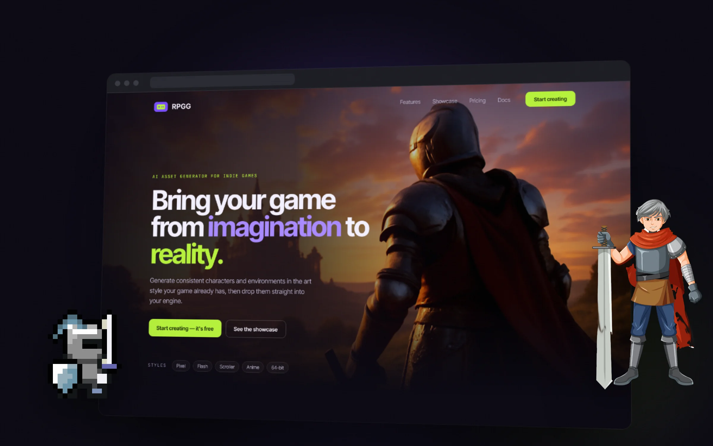
View NowRPGG
A landing page for an AI tool that generates consistent game assets, redesigned from v1 to v2 for clarity and conversion.
v2 got sharper by removing things: a second background, decorative shapes and duplicate buttons.
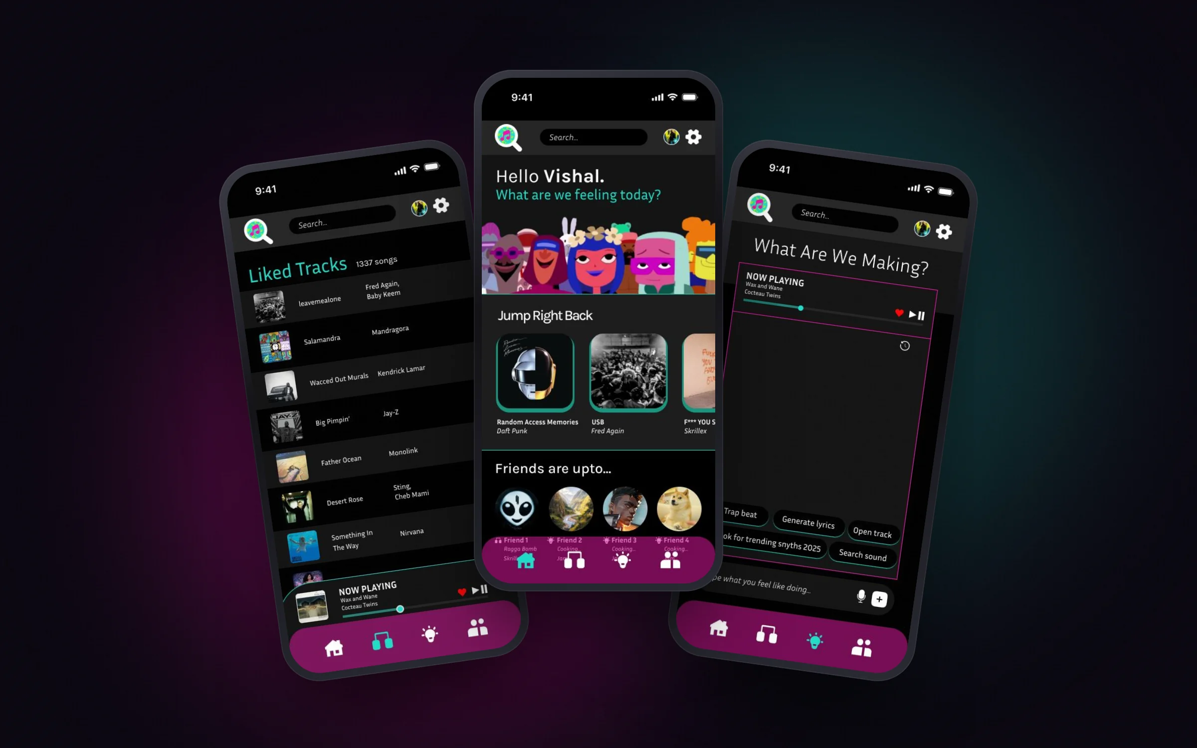
View Nowm(us)ic
What if listening to music was social again? A concept app for shared listening and AI-assisted beat-making.
A full concept, from research and IA to visual identity. Everything sits within two taps.
View NowBrand · Editorial · UX
More projects.
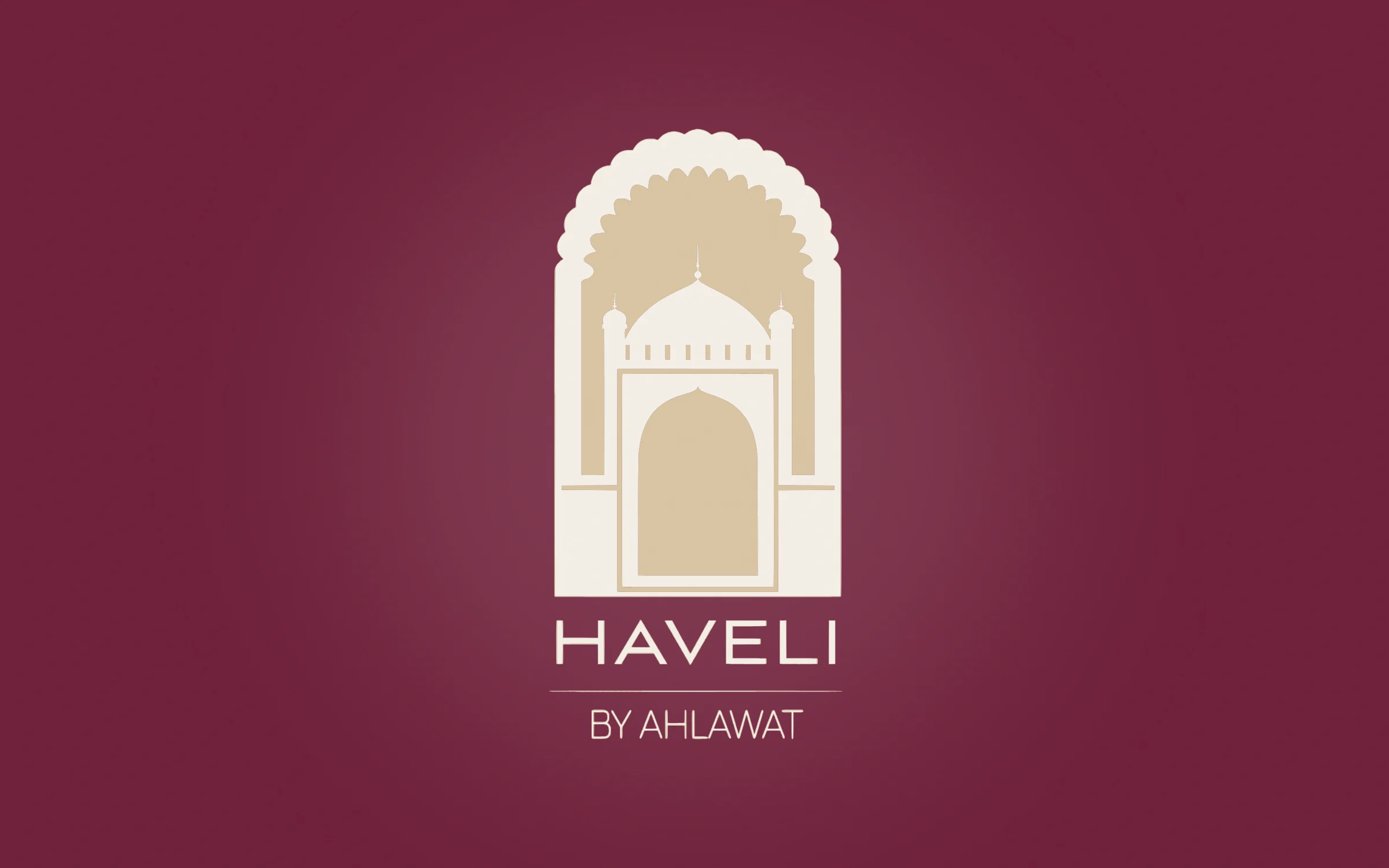
Haveli by Ahlawat
An identity inspired by the arched gateways of North Indian havelis: heritage, held in a simple two-colour mark.
One two-colour mark, carried from logo to packaging.
TLPS — Teaching Learning Practices Survey
An editorial identity for an education research survey: a serious serif, warm plum-to-chalk gradients, and a palette that works in charts.
A gradient palette that also works in charts and dashboards.
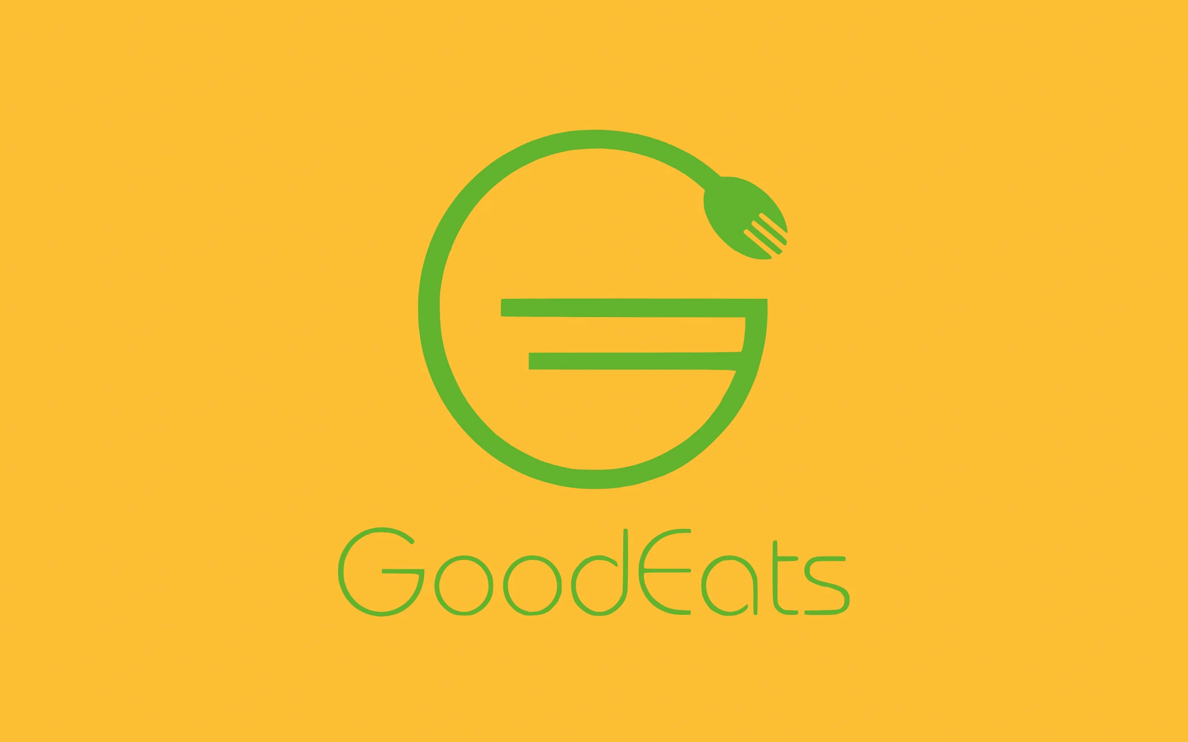
GoodEats
A friendly identity for a healthy-food brand: a fork folded into the letter G.
Mark, logotype, lockups, signage and menu.
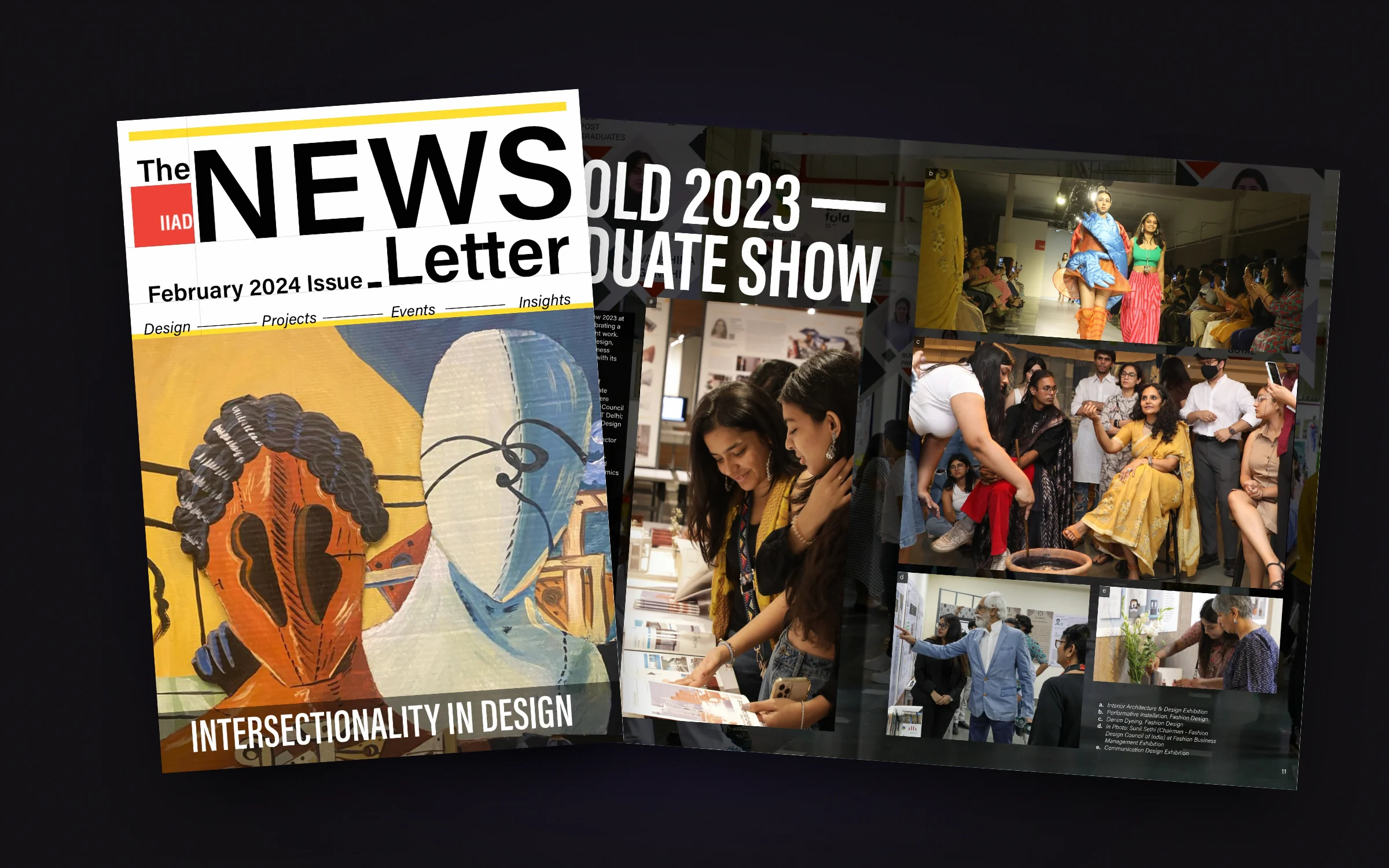
IIAD Newsletter
A 31-page newsletter for the Indian Institute of Art and Design, built on one grid with bold condensed section openers.
31 pages on one grid.
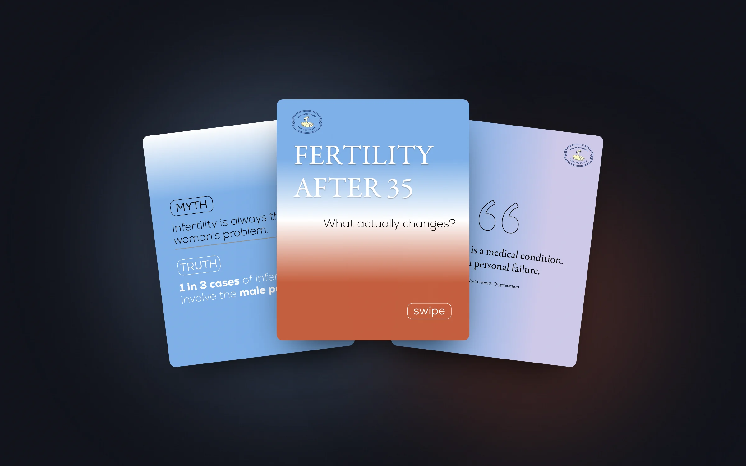
Dr Lakshmi · The Parenthood Fertility Clinic
A calm, clear social content system for a sensitive health topic, built so a fertility clinic can talk about hard facts without fear.
Five reusable templates for a sensitive topic.
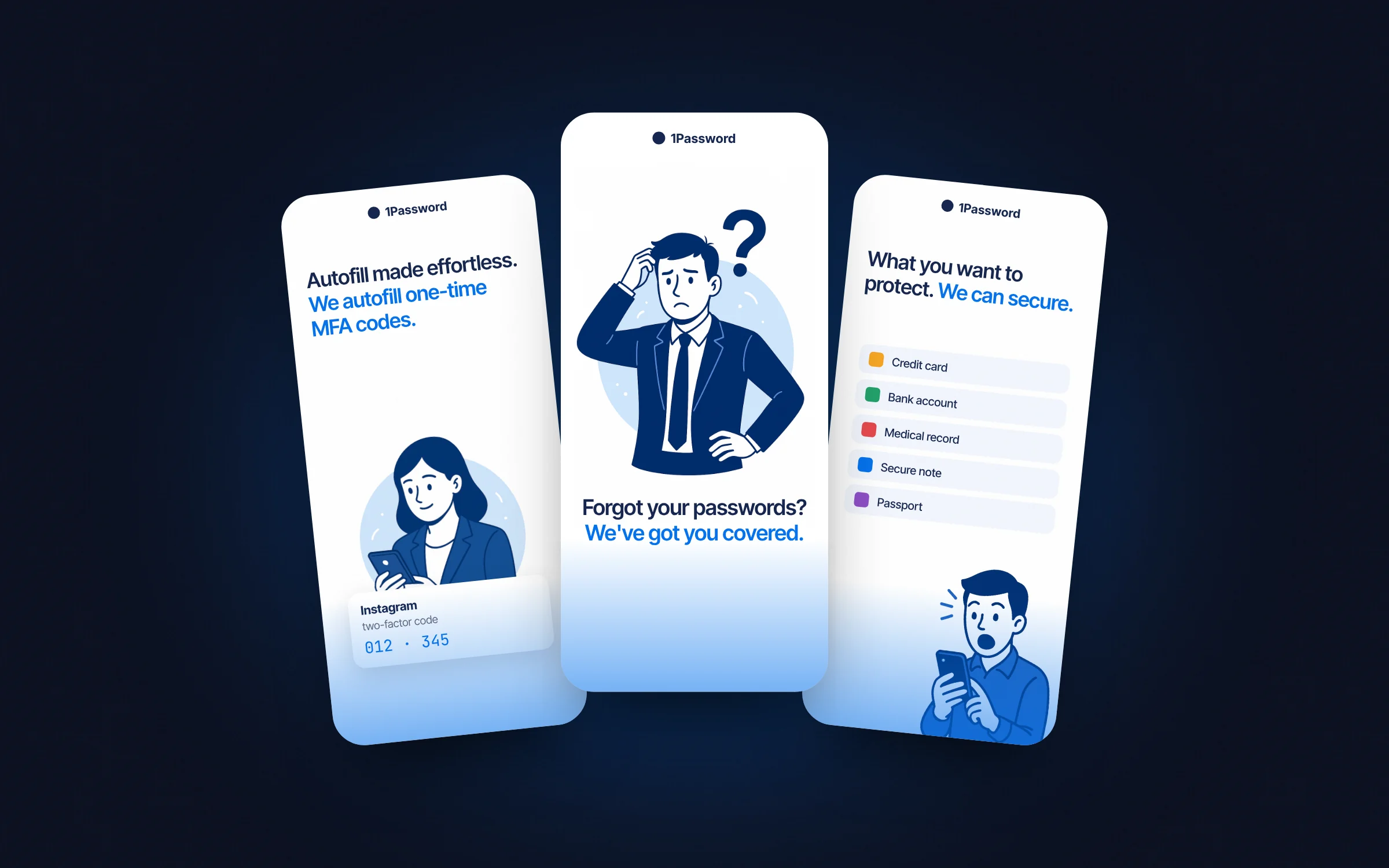
1Password Onboarding Redesign
A critique and redesign of 1Password's App Store screens. What was getting in the way, and why.
Six screens critiqued, five redesigned in one visual world.
02 — How I work
Four rules I work by.
-
01Map it before I make it.
I start with flows and information architecture, not screens. First, I understand who the user is.
-
02Clarity is a safety feature.
In audit-heavy products, a clear hierarchy prevents errors, not just confusion.
-
03Brand is the last 10% people remember.
Type, colour and motion carry meaning, so I design them on purpose.
-
04Design with the people who build it.
I work closely with product, engineering and sales, because a design that can't ship is a drawing.
03 — Experience
From agency brand work to regulated SaaS.
- UI/UX Designer
 Collabrix, HyderabadFeb 2025 – present
 - Branding and Communications Executive
 Indian Institute of Art and Design, New DelhiSep 2023 – Oct 2024
 - Design and Content Associate
 The Design Cart, New DelhiJan 2023 – Jun 2023
 - Branding and Design Intern
 FLAVA Design Agency, SingaporeJul 2022 – Sep 2022
Education
- Diploma in Design Communication · Orita Sinclair, Singapore
- BA Communication and Media Studies / PR · Murdoch University, Singapore
- Diploma in Mass Communication · Kaplan, Singapore
Tools
- Figma
- Framer
- Shopify
- Claude
- Gemini
- ChatGPT
- Photoshop
- Illustrator
- Premiere Pro
- InDesign
- Canva
- Word
- Excel
- PowerPoint
04 — About
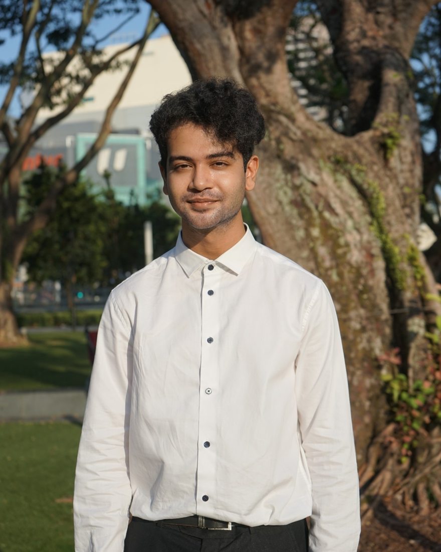
About Designer
Vishal is a UI/UX designer from Hyderabad. Trained in communication and design in Singapore, Vishal worked in branding at agencies and at IIAD, and now designs B2B SaaS at Collabrix. In this work, clarity, hierarchy and interaction logic matter as much as how things look.
05 — Contact
Let's make it happen.
Open to full-time UI/UX and Communication design opportunities.