
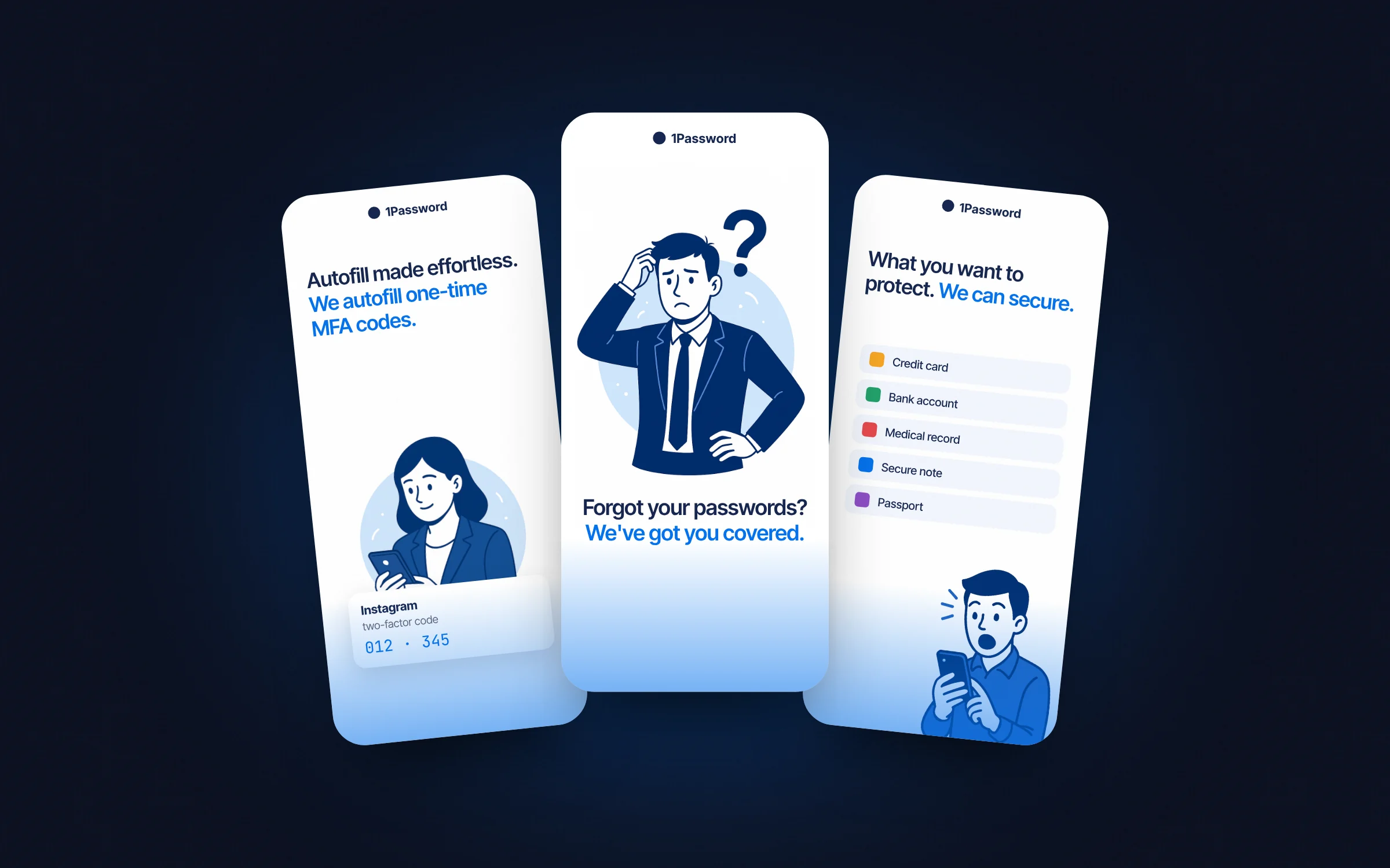
01 — The original store screens
Six screens, six different ideas of what matters.
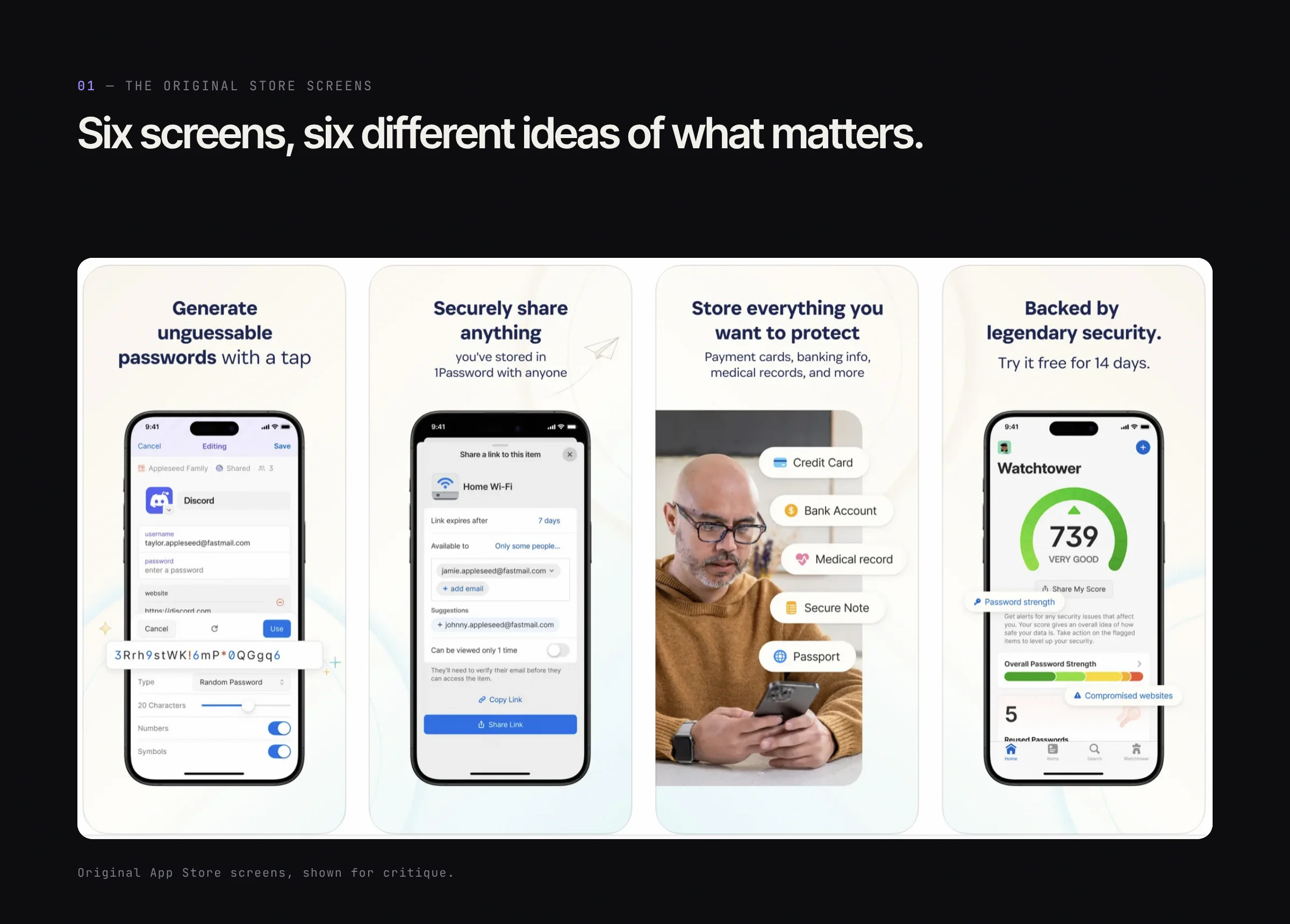
Original App Store screens, shown for critique.
02 — The redesign
One idea per screen, one illustrated world.
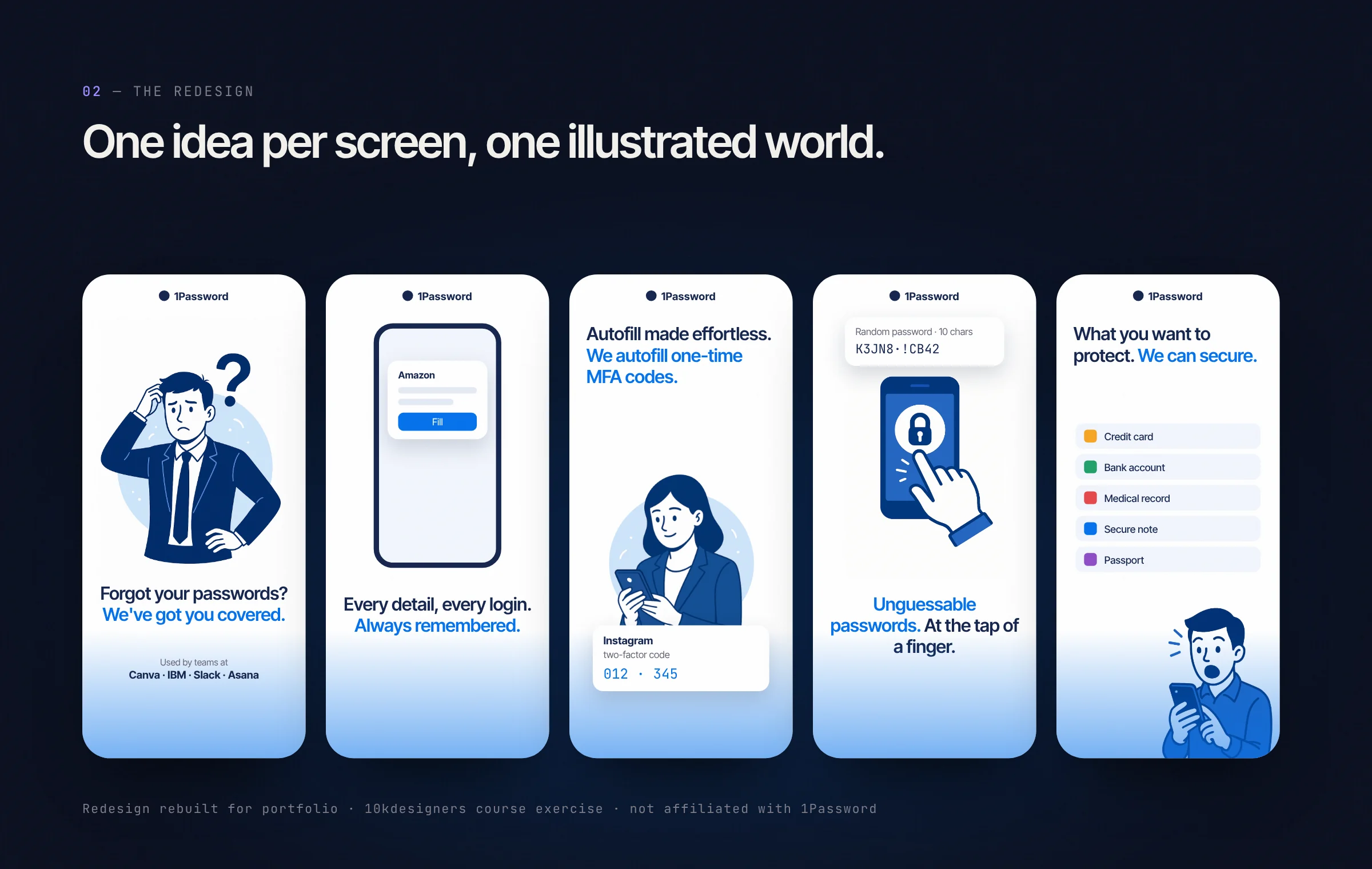
Rebuilt for this portfolio · 10kdesigners course exercise · not affiliated with 1Password.
03 — Critique
What changed, and why.
- 01
One idea per screen
Each screen sells a single benefit, so a scroll through the store tells one story.
- 02
Headline first
Large two-tone headlines read at thumbnail size; tiny UI screenshots don't.
- 03
One visual world
A single illustration style replaces the mix of stock photos and UI captures.
- 04
Trust up front
"Used by" social proof moves to the first screen, where the decision starts.