Who it's for
Indie developers and small studios who need a lot of art (NPCs, environments, variations) but don't have a full art team. They care about consistency, engine-ready exports and price.
01 — Iteration
Same idea, sharper first impression.
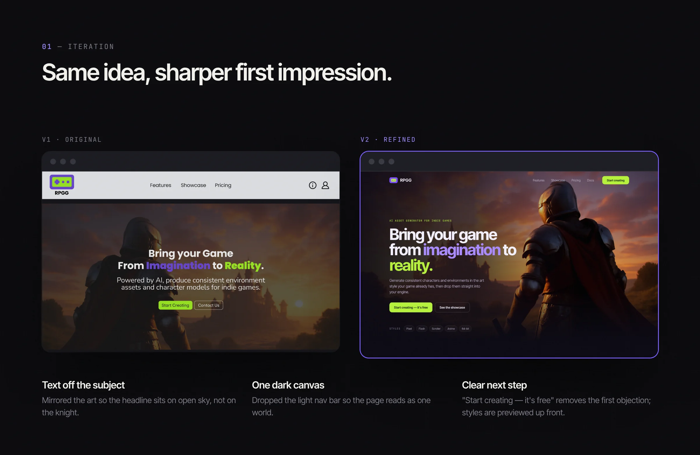
I designed the first version, then came back to it with fresh eyes. The idea stayed the same; the execution got sharper.
- 01
Text off the subject
Mirrored the art so the headline sits on open sky, not on the knight.
- 02
One dark canvas
Dropped the light nav bar so the page reads as one world.
- 03
A clear next step
"Start creating — it's free" removes the first objection; styles are previewed up front.
02 — Style picker
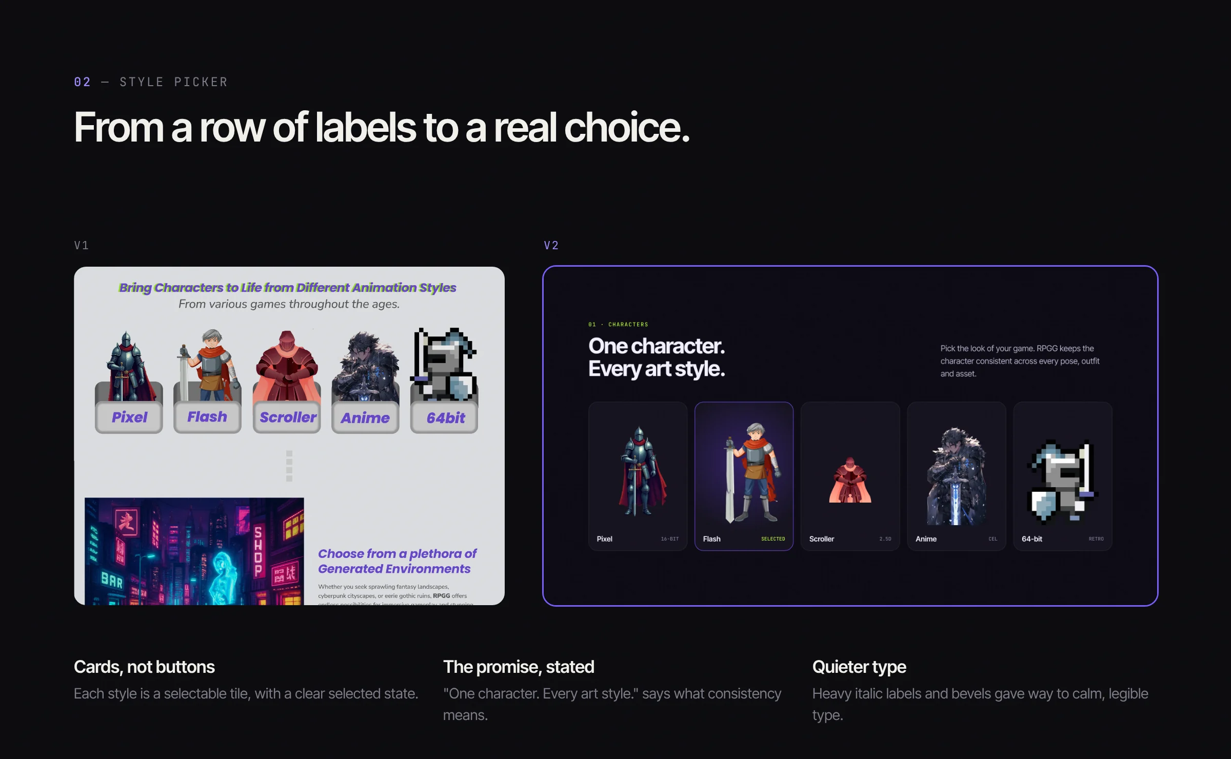
From a row of labels to a real choice.
- 01
Cards, not buttons
Each style is a selectable tile, with a clear selected state.
- 02
The promise, stated
"One character. Every art style." says what consistency means.
- 03
Quieter type
Heavy italic labels and bevels gave way to calm, legible type.
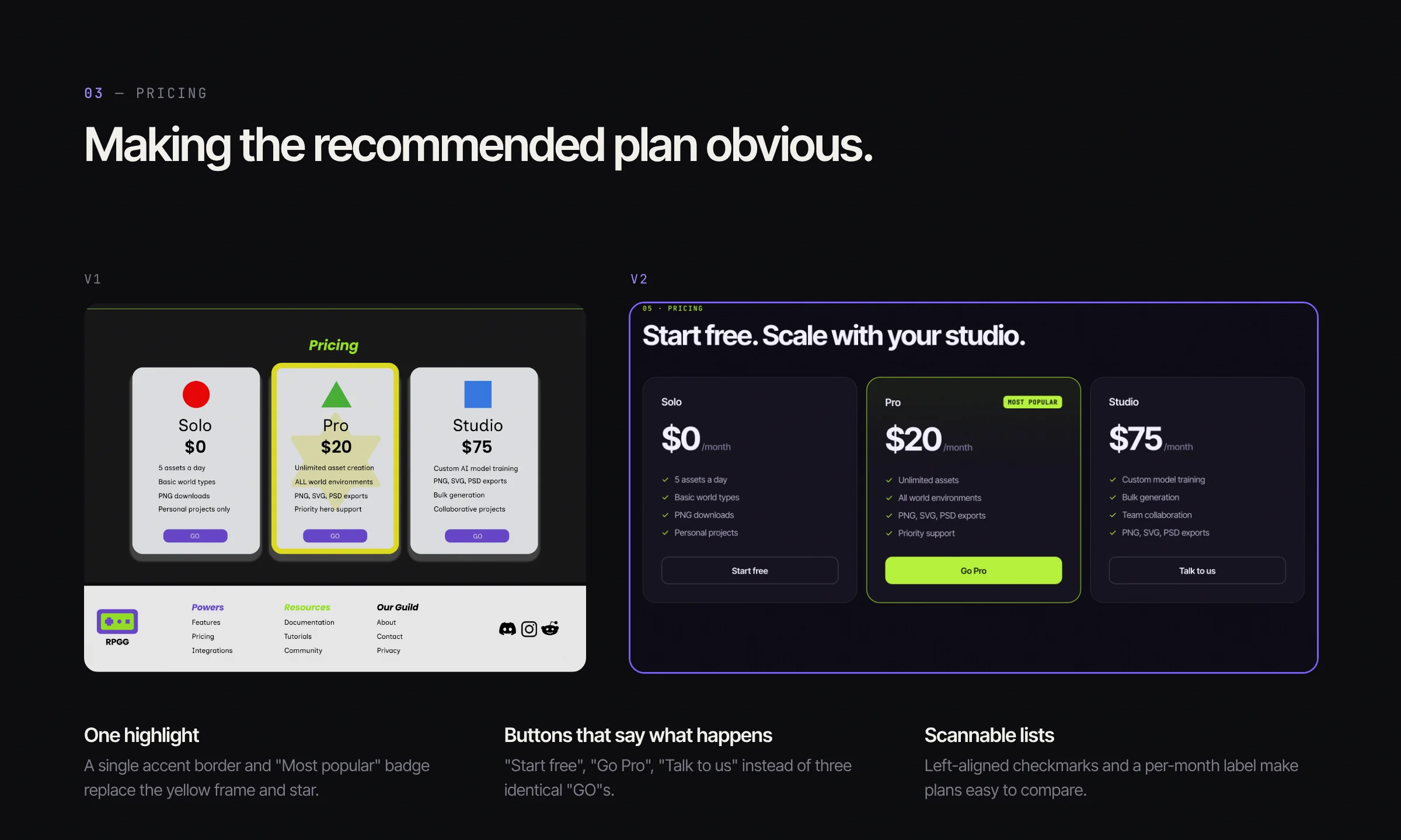
03 — Pricing
Making the recommended plan obvious.
- 01
One highlight
A single accent border and "Most popular" badge replace the yellow frame and star.
- 02
Buttons that say what happens
"Start free", "Go Pro", "Talk to us" instead of three identical "GO"s.
- 03
Scannable lists
Left-aligned checkmarks and a per-month label make plans easy to compare.
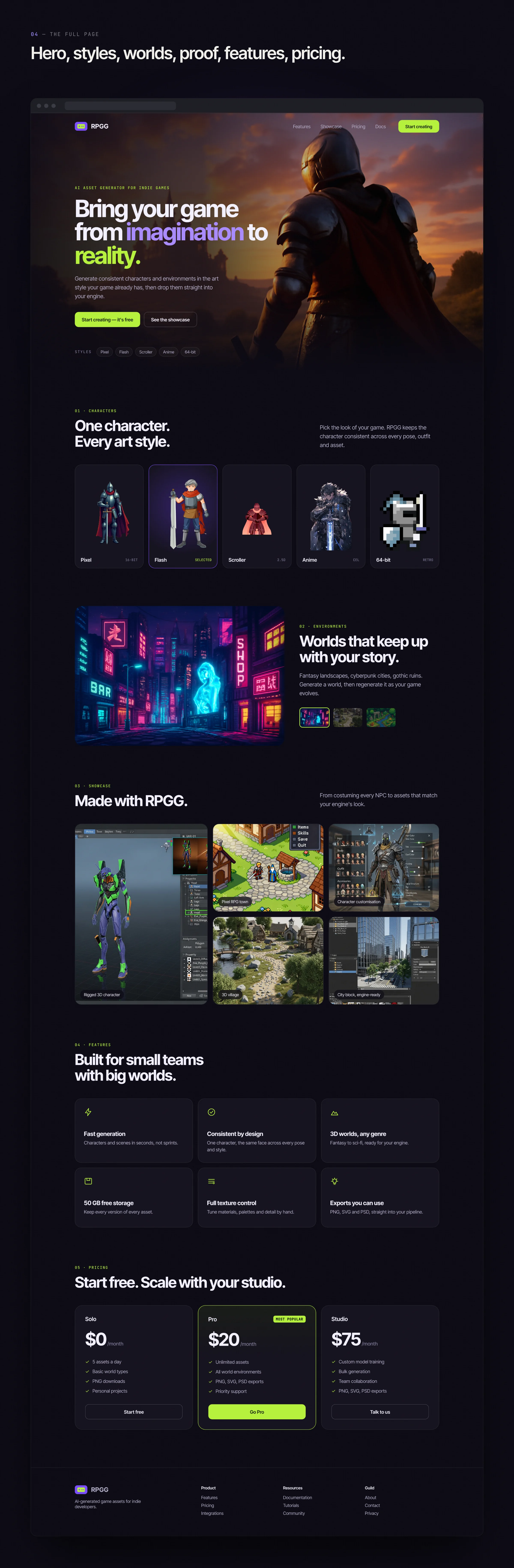
04 — The full page
Hero, styles, worlds, proof, features, pricing.
Each section answers the next question a developer would ask.
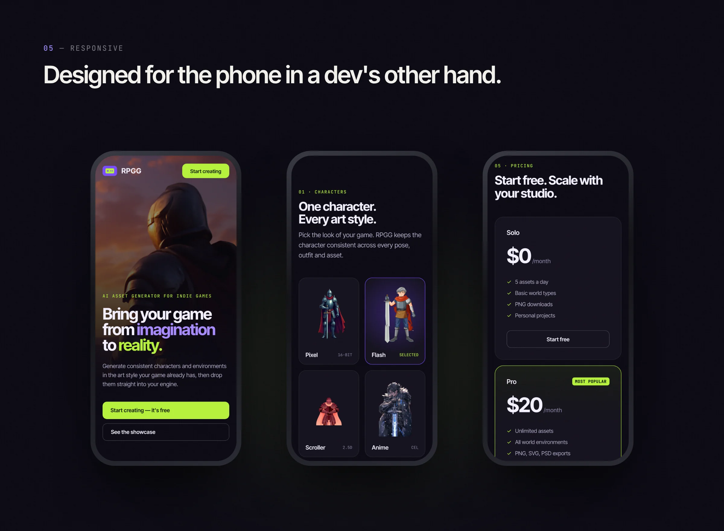
05 — Responsive
Designed for the phone in a dev's other hand.
06 — What I learned
Less, but sharper.
Revisiting your own work is the fastest design critique there is. Most of v2's gains came from removing things: a second background, decorative shapes and duplicate buttons.